The Art of Absence: How Leading Studios Harness Empty Space to Command Attention
There is a particular kind of confidence required to leave something blank. In an industry where clients often equate volume with value — more imagery, more copy, more visual activity — the deliberate choice to let a composition breathe runs against every instinct that a crowded creative marketplace tends to reward. And yet, the studios consistently producing the most arresting, most enduring work share a common discipline: they treat emptiness not as an accident, but as an instrument.
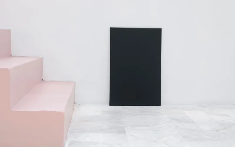
Negative space — the area surrounding or between the subjects of a composition — is among the most misunderstood elements in visual communication. It is not the absence of design. It is design in its most disciplined form.
What Negative Space Actually Does
To understand why empty space carries such weight, it helps to consider how the human eye processes a visual field. Attention is not distributed evenly. The eye seeks contrast, hierarchy, and rest. When a composition is dense, the eye becomes fatigued, moving rapidly without settling. When space is introduced with intention, the eye is guided — directed toward what matters, allowed to linger, and ultimately given the cognitive room to feel something.
This is not a passive process. A skilled studio engineer uses negative space the way a film director uses silence: not as a gap in the work, but as a structural element that gives the surrounding material its full weight.
Consider how some of the most recognized American brand identities function in practice. The spare typographic lockups used by luxury retailers, the wide margins in high-end print campaigns, the long, unoccupied frames that appear in prestige automotive advertising — these choices are not accidents of minimalism. They are precise decisions about where the audience's attention should travel and what emotional register the work should occupy.
Restraint as a Signal of Sophistication
There is a reason that premium brands across virtually every sector — from fashion to finance to technology — tend to gravitate toward compositions with generous breathing room. Empty space communicates something that no headline or visual element can communicate on its own: confidence.
A brand that crowds its canvas is, in effect, arguing for its own relevance. A brand that leaves space is assuming it. The distinction is immediately legible to an audience, even when the audience cannot articulate why one execution feels more authoritative than another.
Professional studios recognize this dynamic and use it deliberately. When a client arrives requesting that every inch of a layout be utilized — that every product feature be listed, that every visual asset be incorporated — the experienced creative director understands that the request, however well-intentioned, is likely to undermine the very impact the client is hoping to achieve. Part of the studio's value lies in its ability to make that case persuasively, to demonstrate through mockups and precedent that the work will perform better when it is allowed to breathe.
Application Across Media
The principle extends well beyond print and brand design. In film and video production, negative space operates through composition, pacing, and sound design simultaneously. A wide shot that positions a subject in the lower third of the frame, surrounded by open landscape, communicates isolation or contemplation in a way that no amount of dialogue could replicate. The held pause before a character speaks. The unscored moment in a scene that would have been underlined with music in a less assured production. These are all expressions of the same discipline.
In digital and interactive media, negative space governs the user's sense of ease or friction. Landing pages that give each element room to register convert more effectively than those that layer content aggressively. The white space in a well-constructed web layout is not wasted real estate; it is the mechanism by which the content earns its authority.
Even in audio production — an area where the concept might seem less intuitive — the logic holds. The deliberate rest between musical phrases, the ambient silence that frames a voiceover, the dynamic range that gives a sound design its texture: these are all applications of the same underlying principle. What is absent shapes what is present.
The Craft Discipline Behind the Choice
What separates a studio that uses negative space effectively from one that simply produces sparse work is intentionality. Emptiness without purpose reads as incompleteness. Emptiness with purpose reads as mastery.
The difference lies in the degree to which the space is actively constructed. In practice, this means making decisions about proportion, about the relationship between the occupied and unoccupied areas of a composition, and about the specific emotional response those relationships are designed to produce. It means resisting the impulse to fill — and having a clear rationale for why the restraint serves the work.
At the production level, this discipline requires a studio culture that values the considered over the comprehensive. It requires creative directors who are willing to defend a choice that may initially seem like less, and clients who have developed enough trust in the studio's judgment to engage with the reasoning before reacting to the instinct.
That trust, incidentally, is itself built through the quality of the work that restraint produces. The most compelling argument for leaving something out is a body of work that demonstrates, repeatedly, what leaving something out can achieve.
The Counterintuitive Lesson
The studios that have most fully internalized the power of negative space tend to describe their approach in terms that might surprise those outside the industry. They speak of subtraction as a creative act. They describe the edit — the removal — as often more decisive than the addition. They talk about the moment in a project's development when the work becomes truly strong not as the moment when something is added, but as the moment when something unnecessary is taken away.
This runs counter to the instinct that more effort should produce more visible output. But the most sophisticated creative work rarely announces its effort. It announces its effect.
For any studio serious about the quality of its output — and for any client serious about the quality of what it puts into the world — the willingness to leave space is not a stylistic preference. It is a craft position. It is the understanding that the most powerful statement a composition can make is sometimes the one it makes in silence.